Uncovering the real Omada
Scope
- Brand
- Digital
- Strategy
Challenge
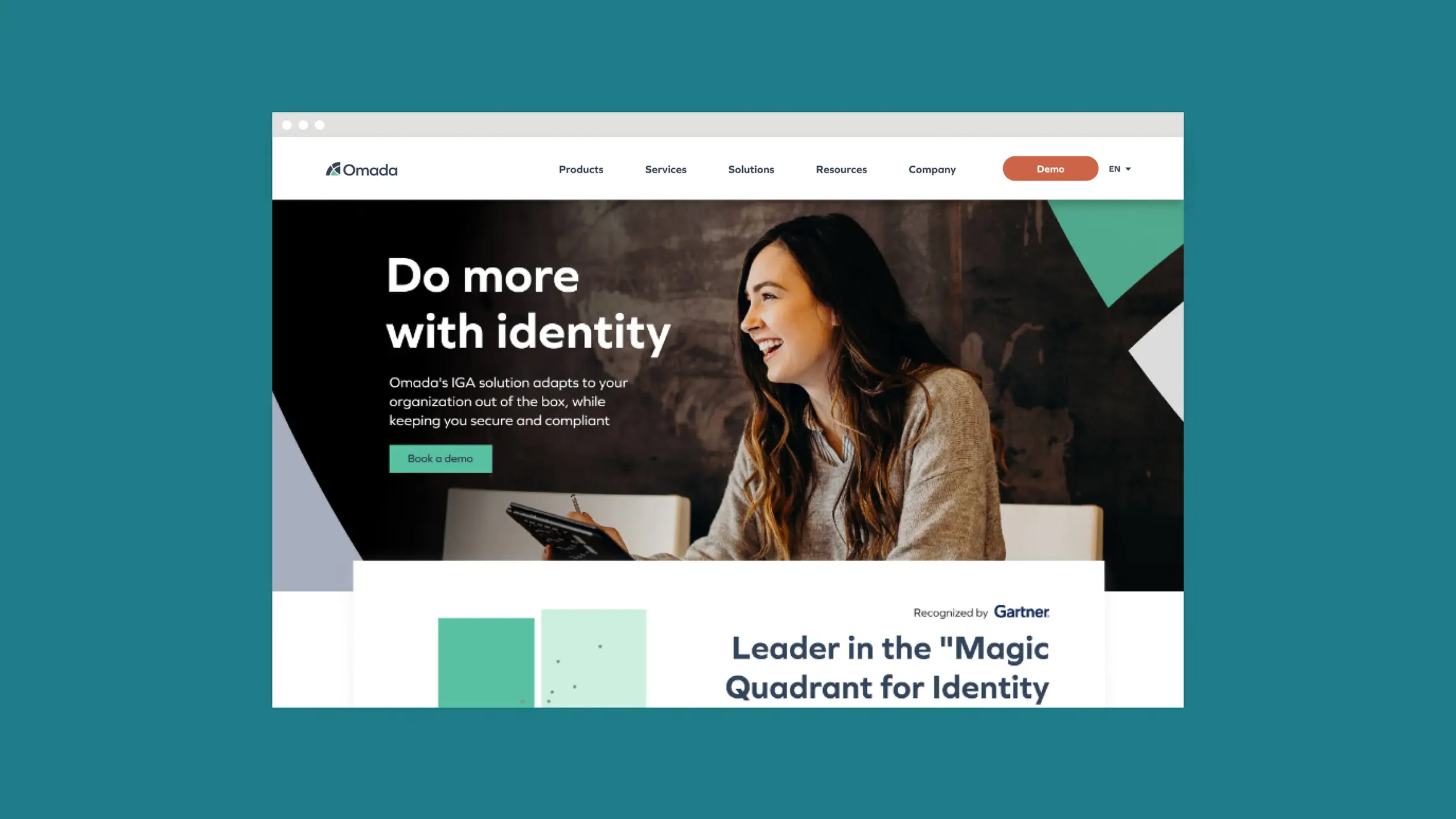
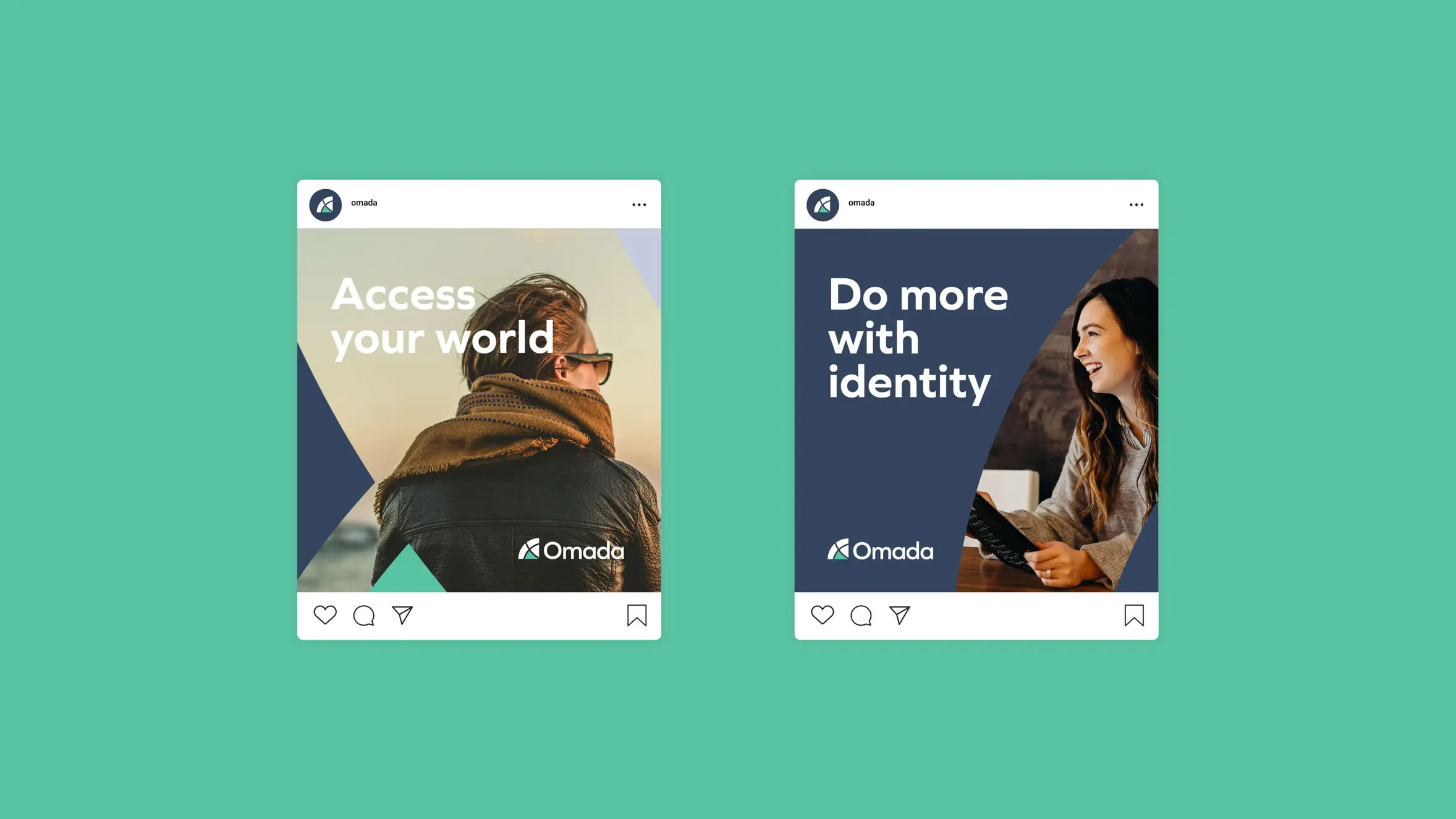
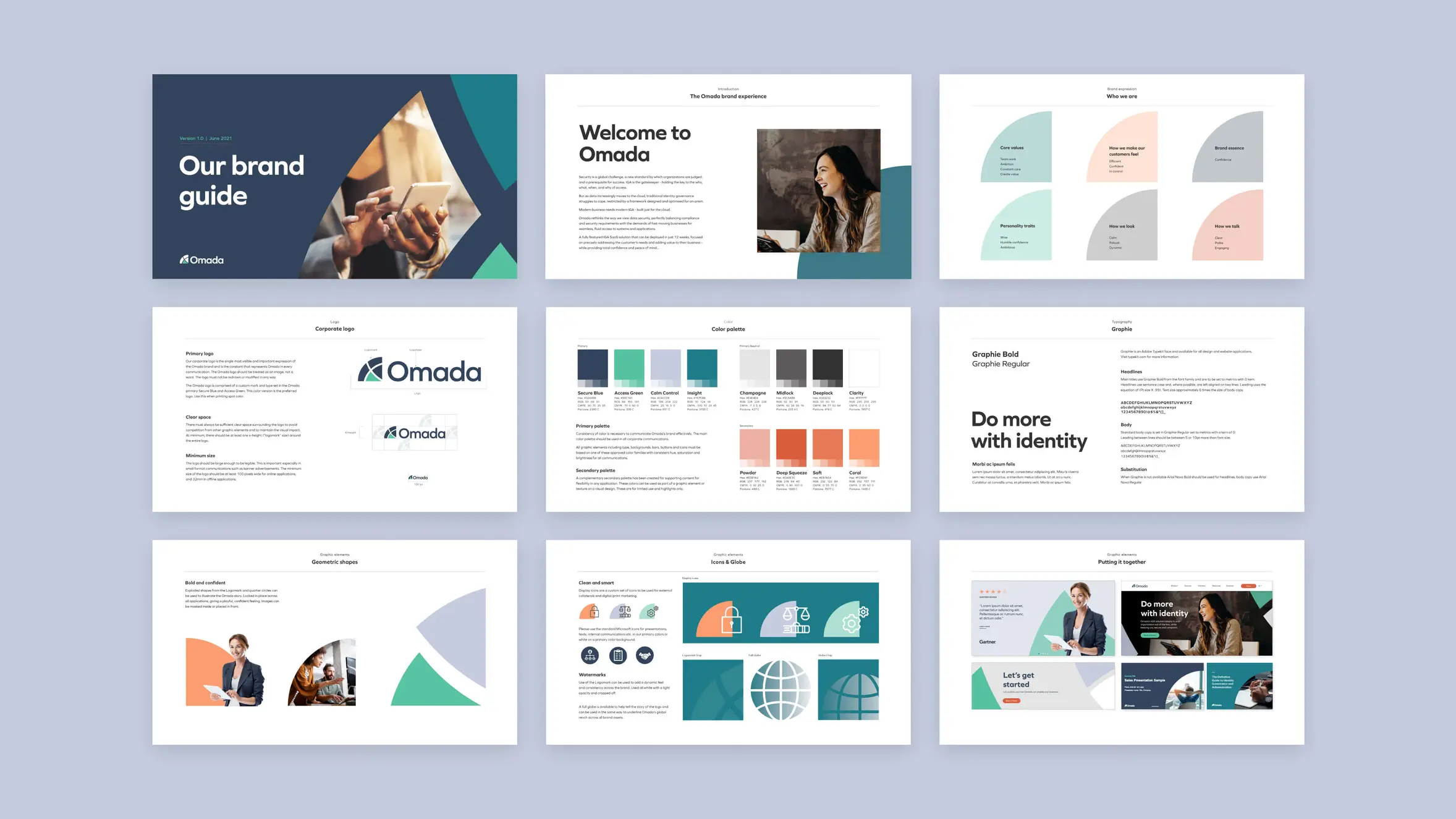
Omada’s true identity and value was obscured by a bland sea of blue, stock photo overload, and too much techie jargon. The new brand needed to lift up the human aspect of the product and company while embodying both their present and future direction.
Approach
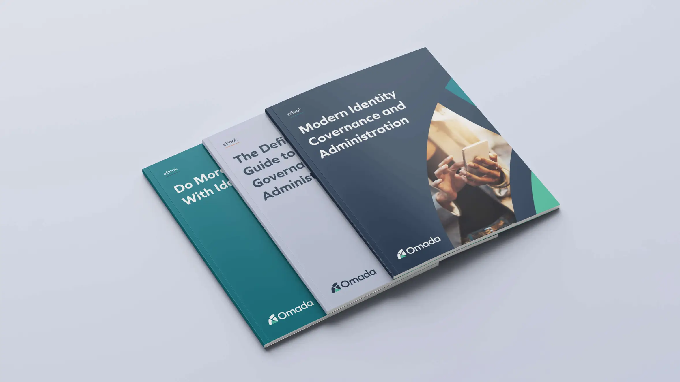
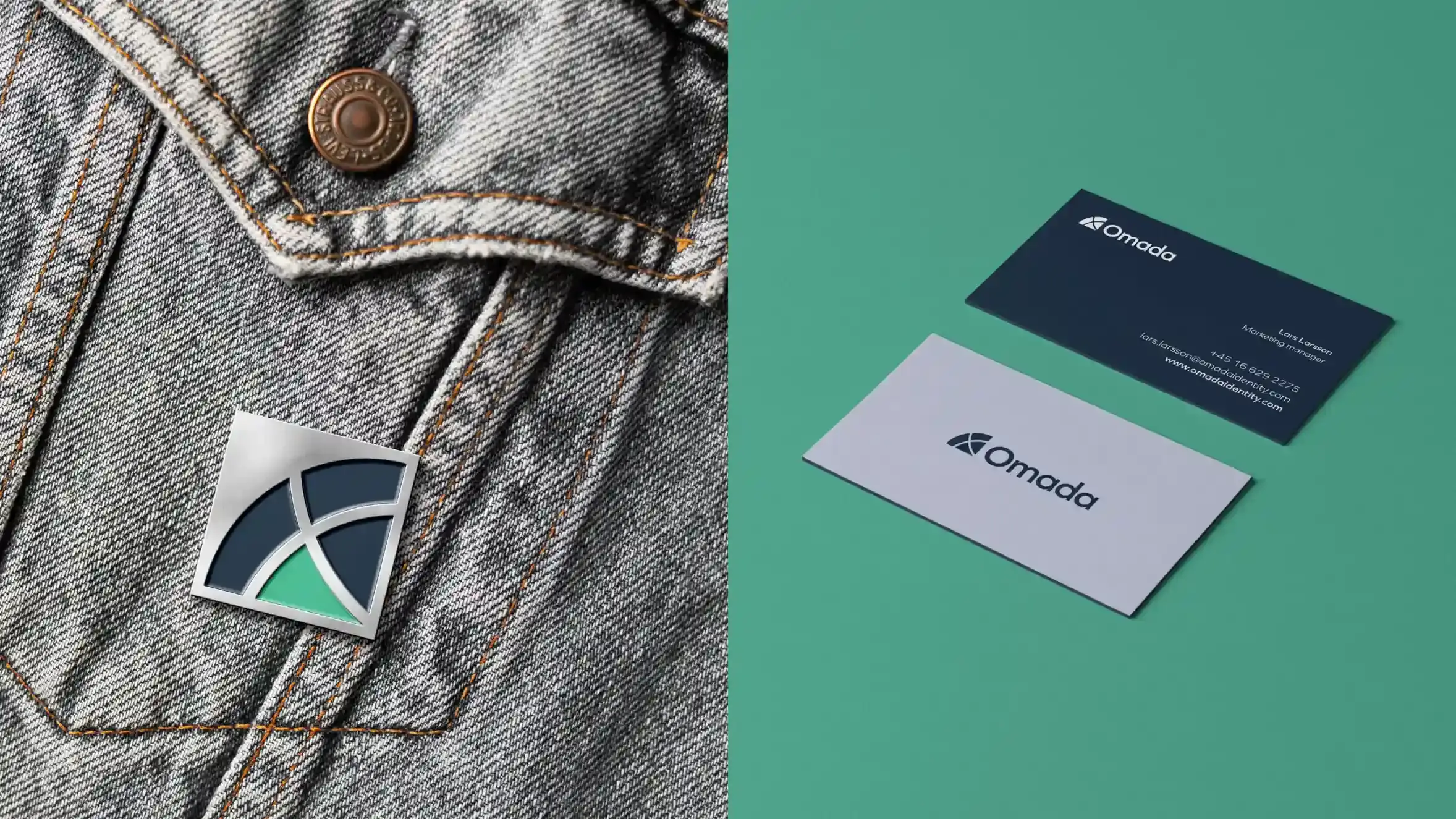
We conducted stakeholder interviews, created personas, and developed a messaging framework to establish Omada’s personality, clear, polite, engaging tone of voice, and confidence-inspiring brand story. A modern, dynamic visual identity incorporates a calming primary color palette, contrasted with a vibrant set of secondary colors. Bold shapes explode from a new quarter-globe logo. The website structure and UX paired crisp typography and conscious spacing with a thoughtful approach for content organization and migration for an easily digestible user experience.
Impact
The new Omada brand positions the company as the confident leader, bold thinker, and trustworthy partner they truly are. The cohesive look and feel embodied by the new website and collateral material allows the Omada team to more effectively share their brand through all channels, with all customers, with marked improvements to website speed and security. We continue to support their CMO and marketing team on retainer while helping to scale their output as they evolve and grow.