This refresh was an opportunity to build an authentic brand that clearly communicates its value better than ever. Sköna uncovered Extreme’s core brand values—rooted in cutting-edge connectivity and fueled by innovation—all built on a genuine commitment to customer success. These values led to a brand essence of ‘Uncompromising Commitment’, a bold articulation of Extreme’s role as a pioneer actively shaping the future of its industry.

Connecting the edge of Extreme
Extreme Networks is a leading provider of AI-native, enterprise-grade cloud networking solutions. With the ambitious ethos of connecting the world more securely and powerfully, Extreme needed a modern scalable brand that reflected their cutting-edge mindset.
Services
- Brand Positioning
- Brand Expression
- Visual Brand System
- Collateral and templates
- Photo Art Direction
- Motion Design
The Strategy

The Creative
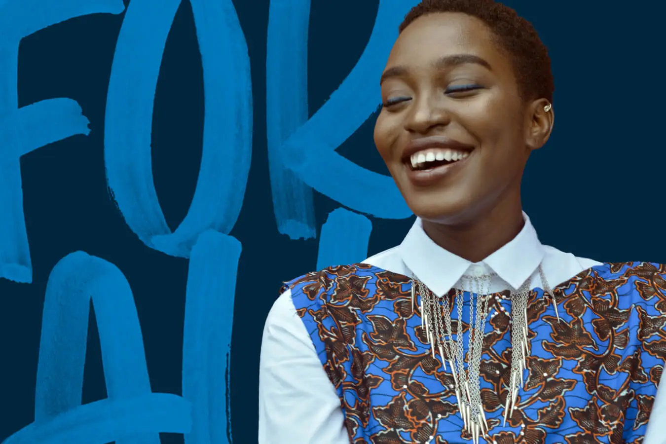
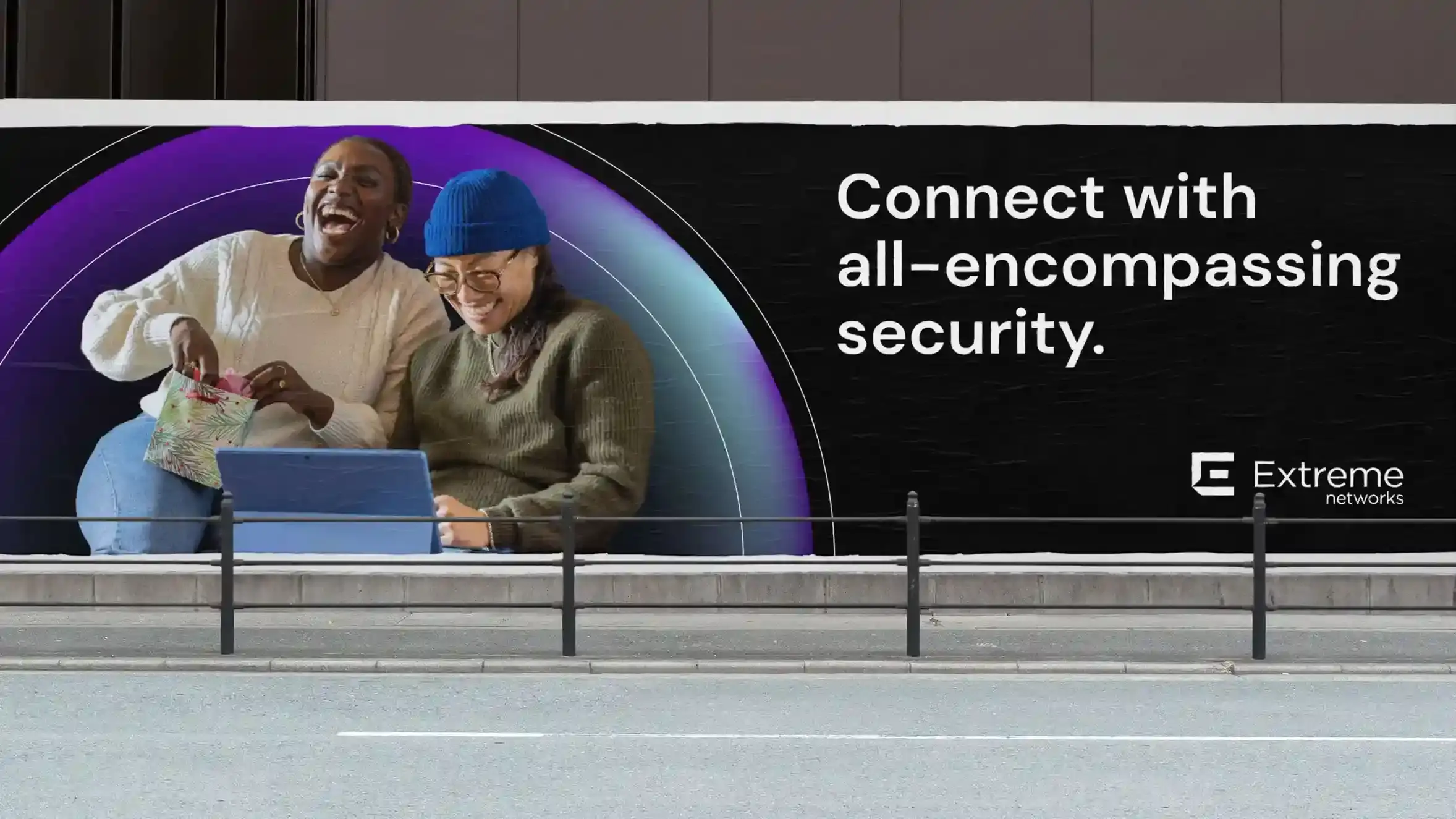
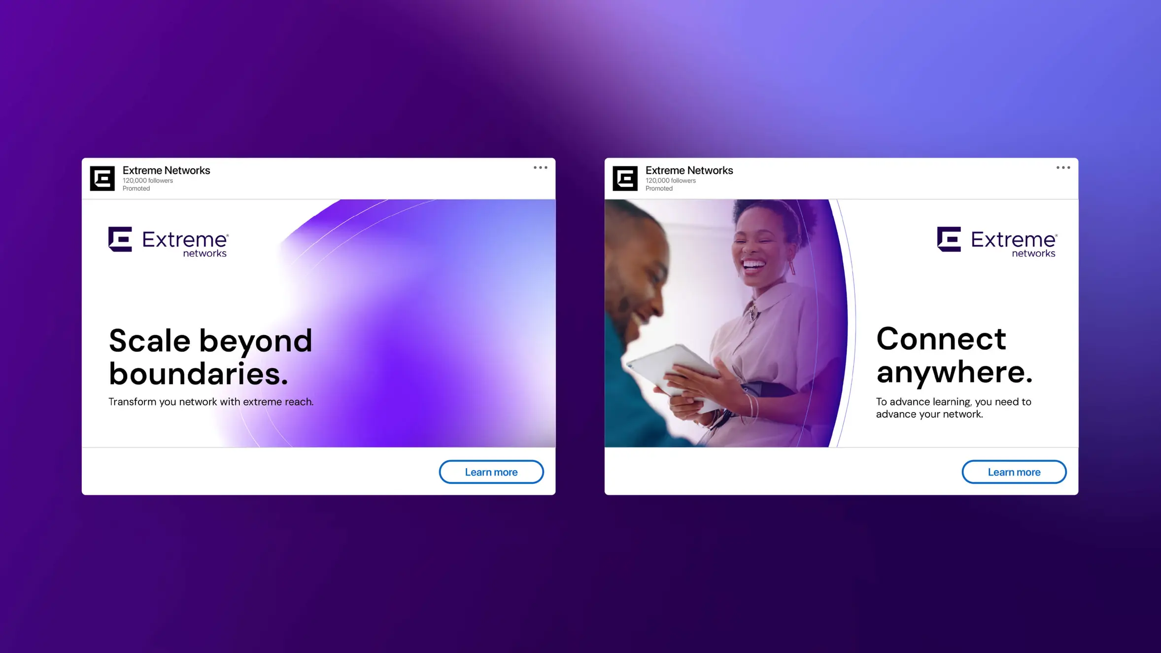
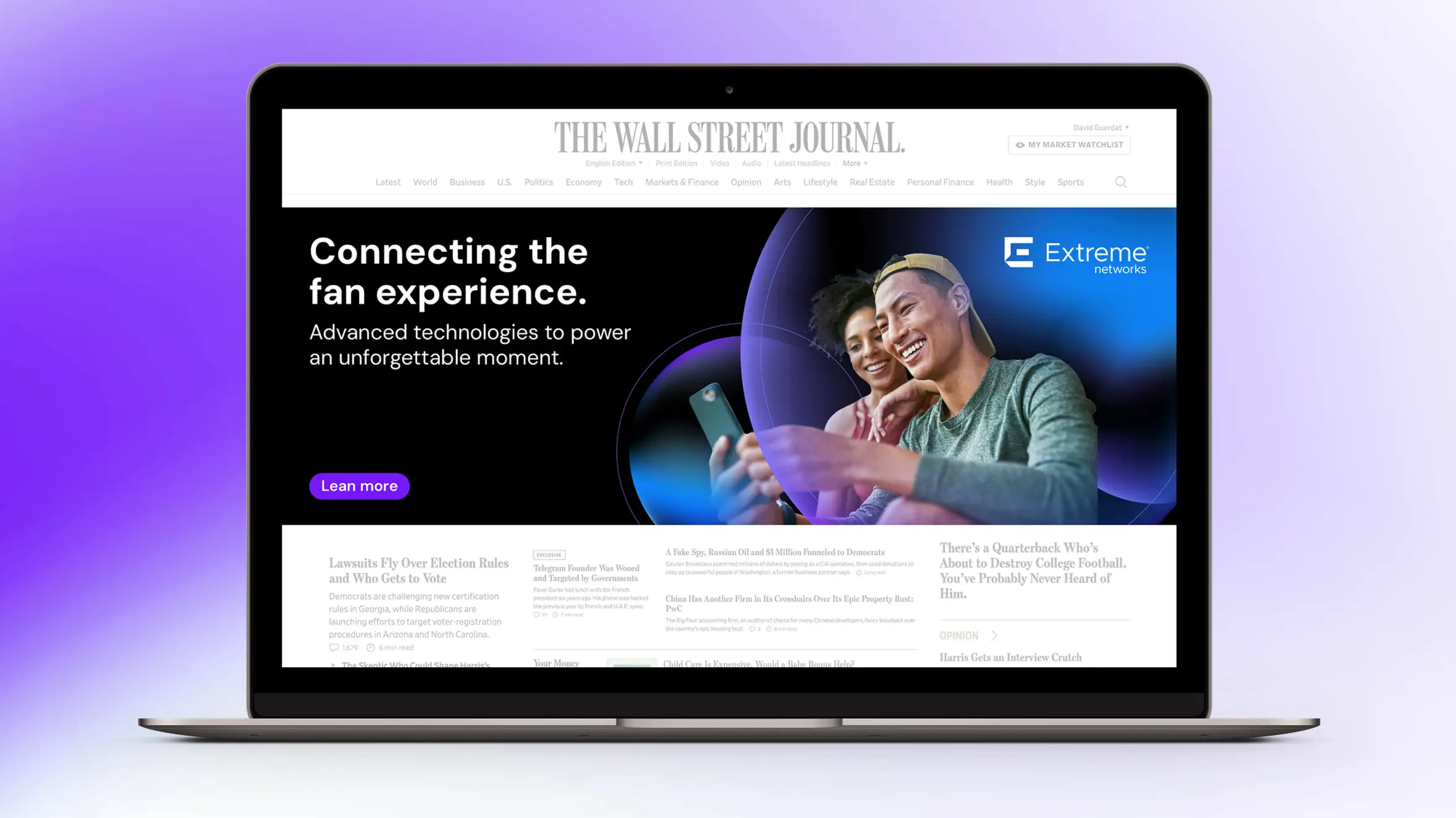
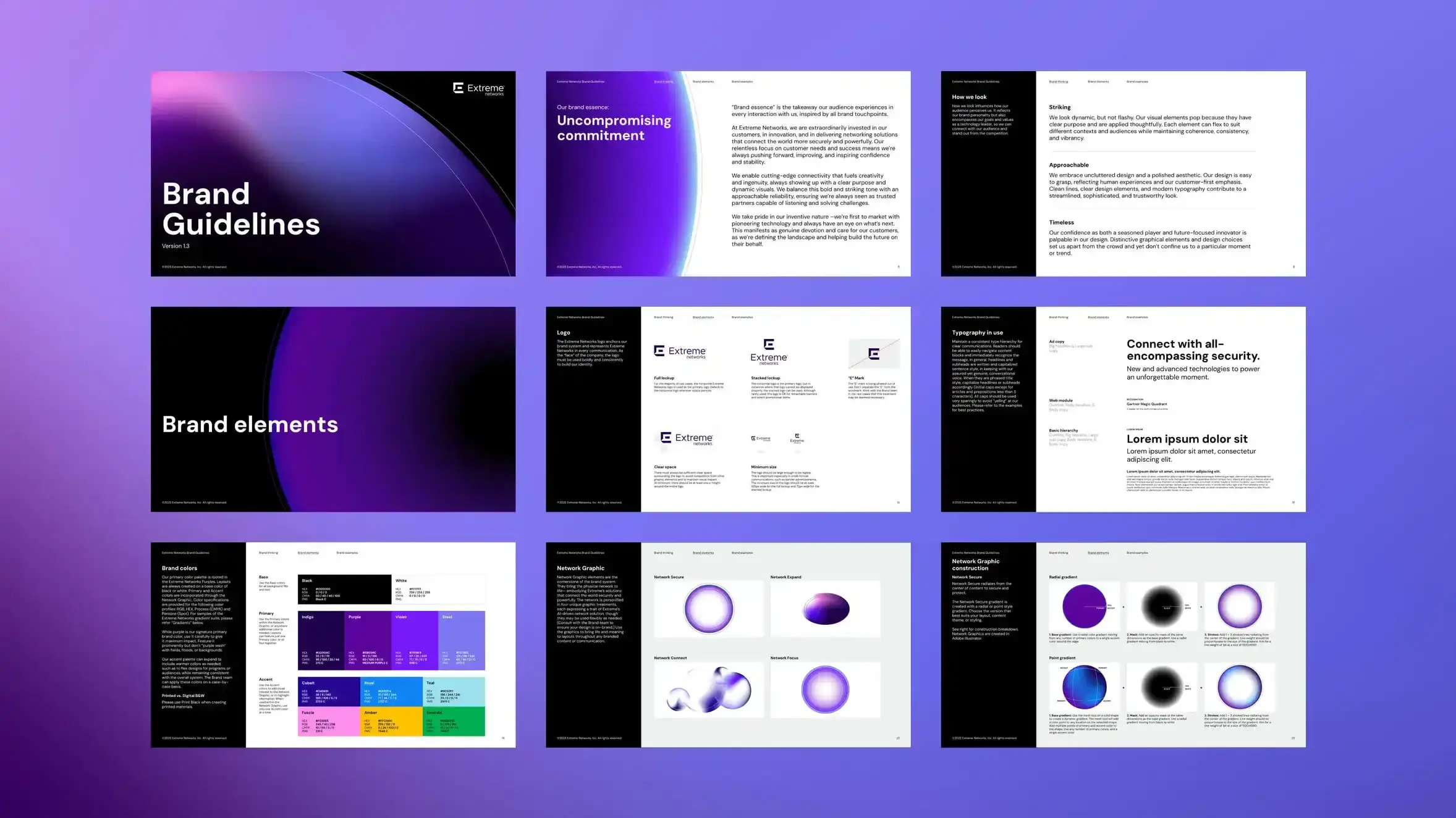
Building on the equity of Extreme’s logo, Sköna developed a dynamic brand system rooted in immersive connection. At its core is the network graphic: a personification of Extreme’s physical network that represents their adaptive, secure, and customer-focused approach to innovation. This living system reinforces the brand’s essence of ‘Uncompromising Commitment’, positioning Extreme as a category leader built to scale with the future.


The Impact
The refreshed brand closely reflected Extreme’s true value and served as an internal rallying point around its commitment. The expanded visual system enabled scalable marketing efforts and ensured consistency across corporate communications, campaigns, and events. The result: a mature, future-ready brand built to lead—and built to last.
Sköna’s creativity, strategic thinking, and communication were exceptional. The results will increase brand awareness, web traffic, and lead gen.
Bryan Middleton, Creative Director, Extreme Networks
Team
Extreme: Gray Chapman, VP Brand Marketing, Bryan Middleton, Creative Director
Skona: Strategy: Andrew Ledford, Art Direction & Design: Matt Domina, Brittany McBride, Maya Jahja, Creative Direction: Matt Domina, Janessa Mason, Alan So, Client Service: Greg Smith