Radical simplicity for LiveRamp
Scope
- Digital
Challenge
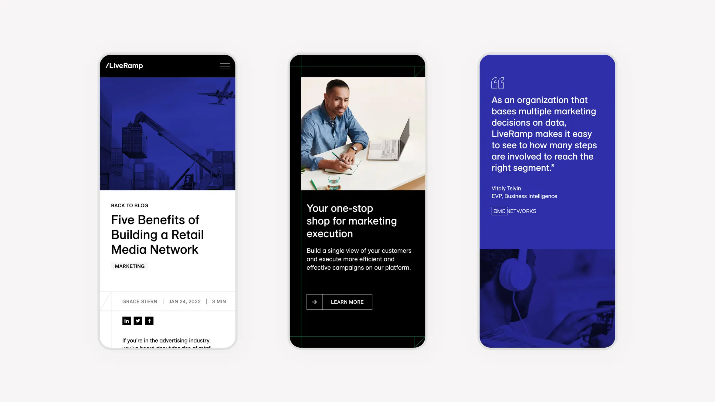
The new website needed to create an optimal, customer-first experience, including simplifying complex ideas and concepts and providing clarity around LiveRamp’s benefits for customers, in keeping with their new brand promise: ‘No Compromises’.
Approach
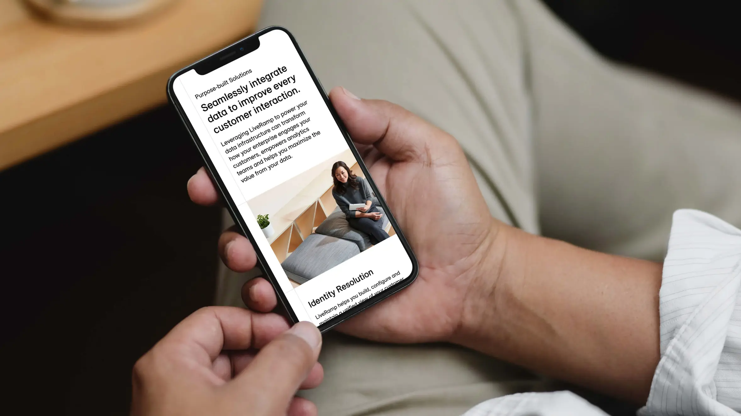
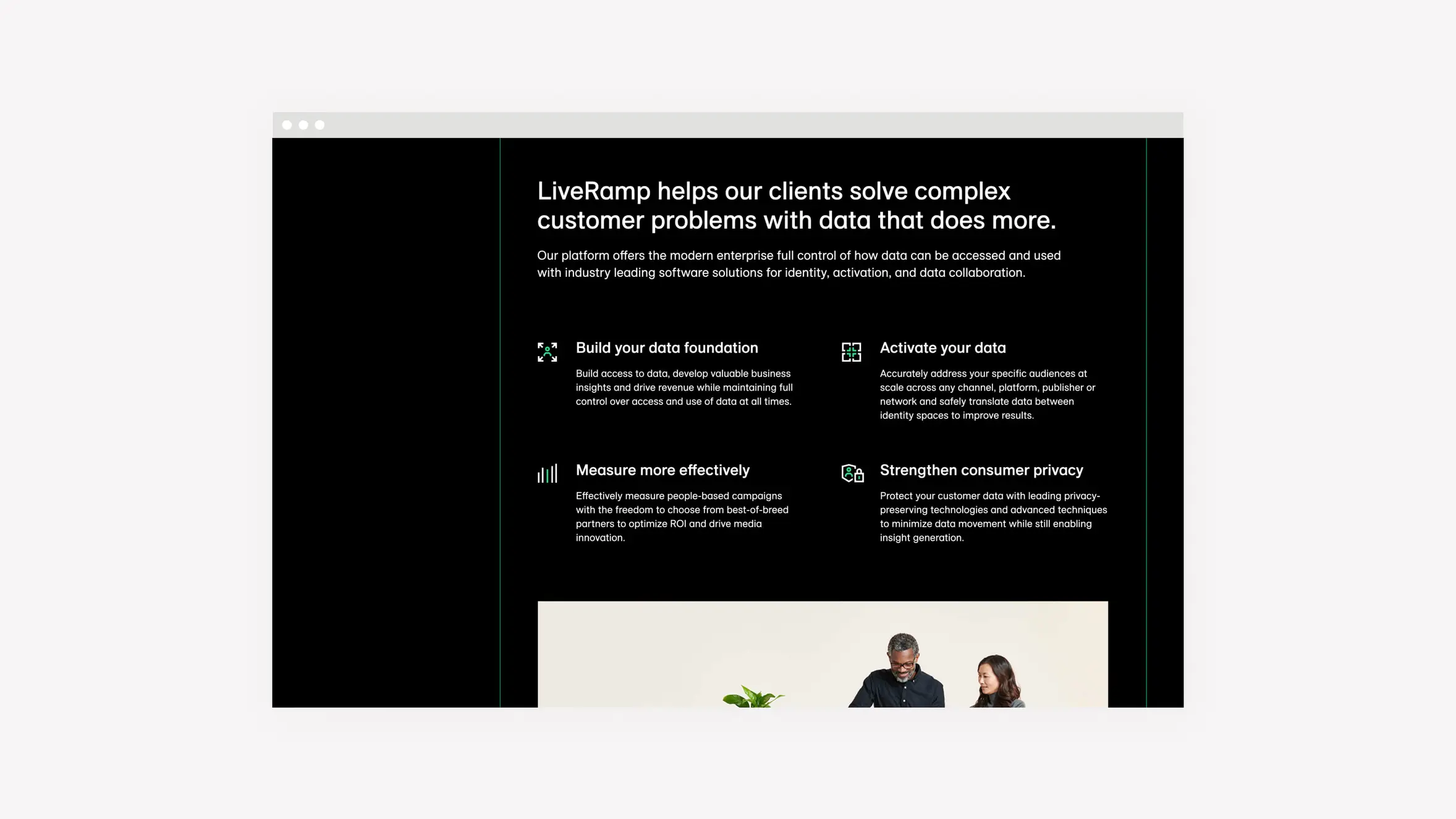
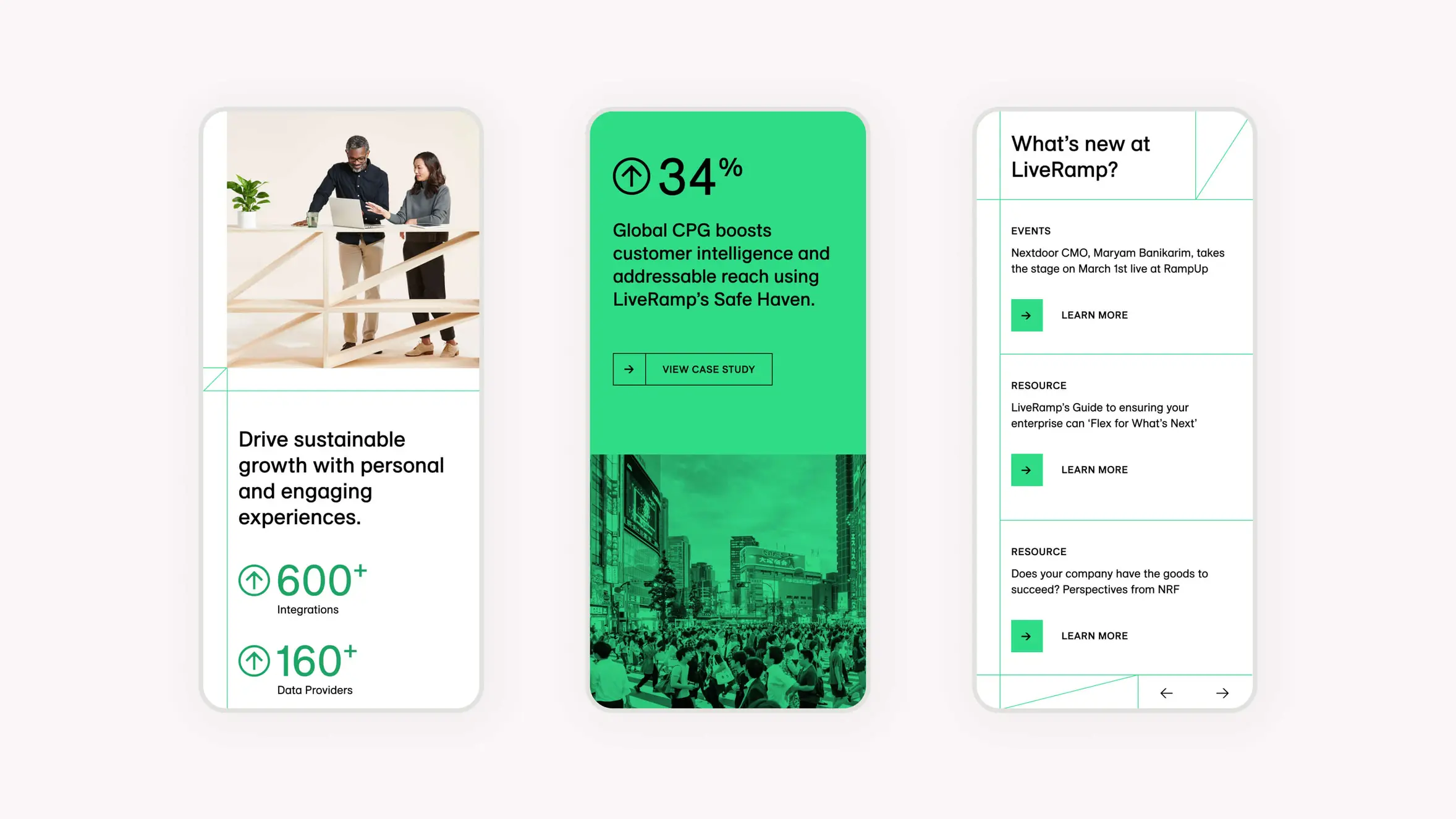
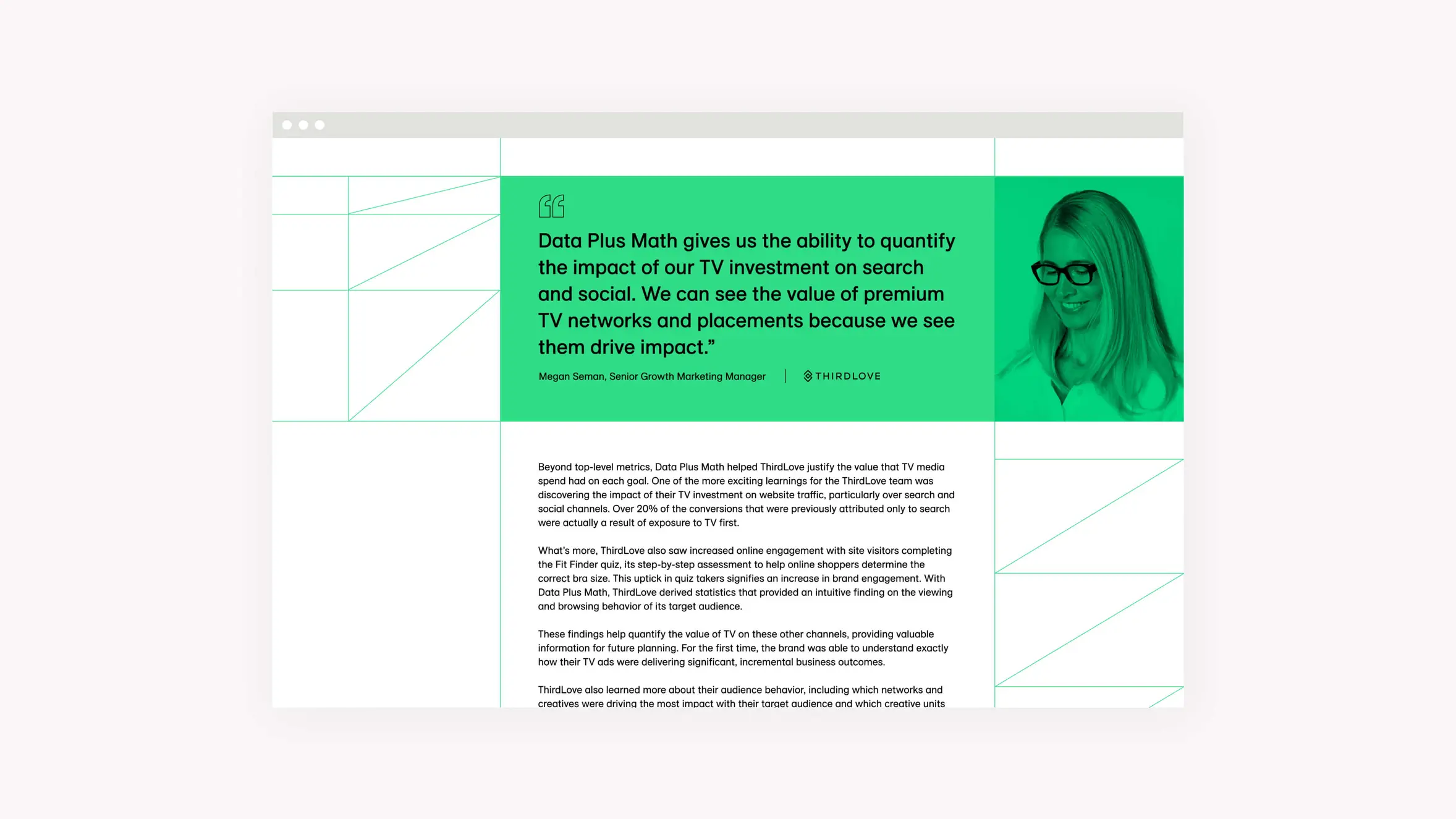
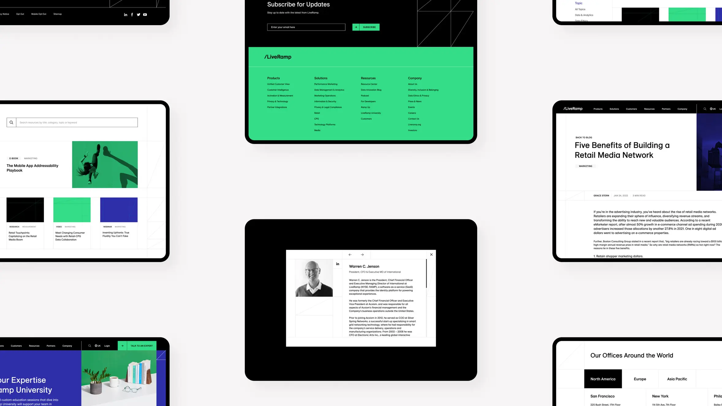
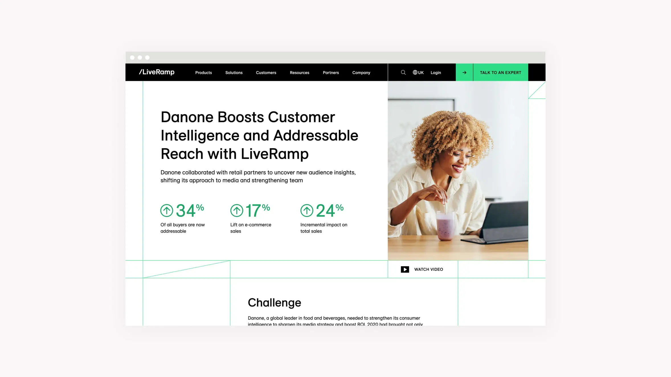
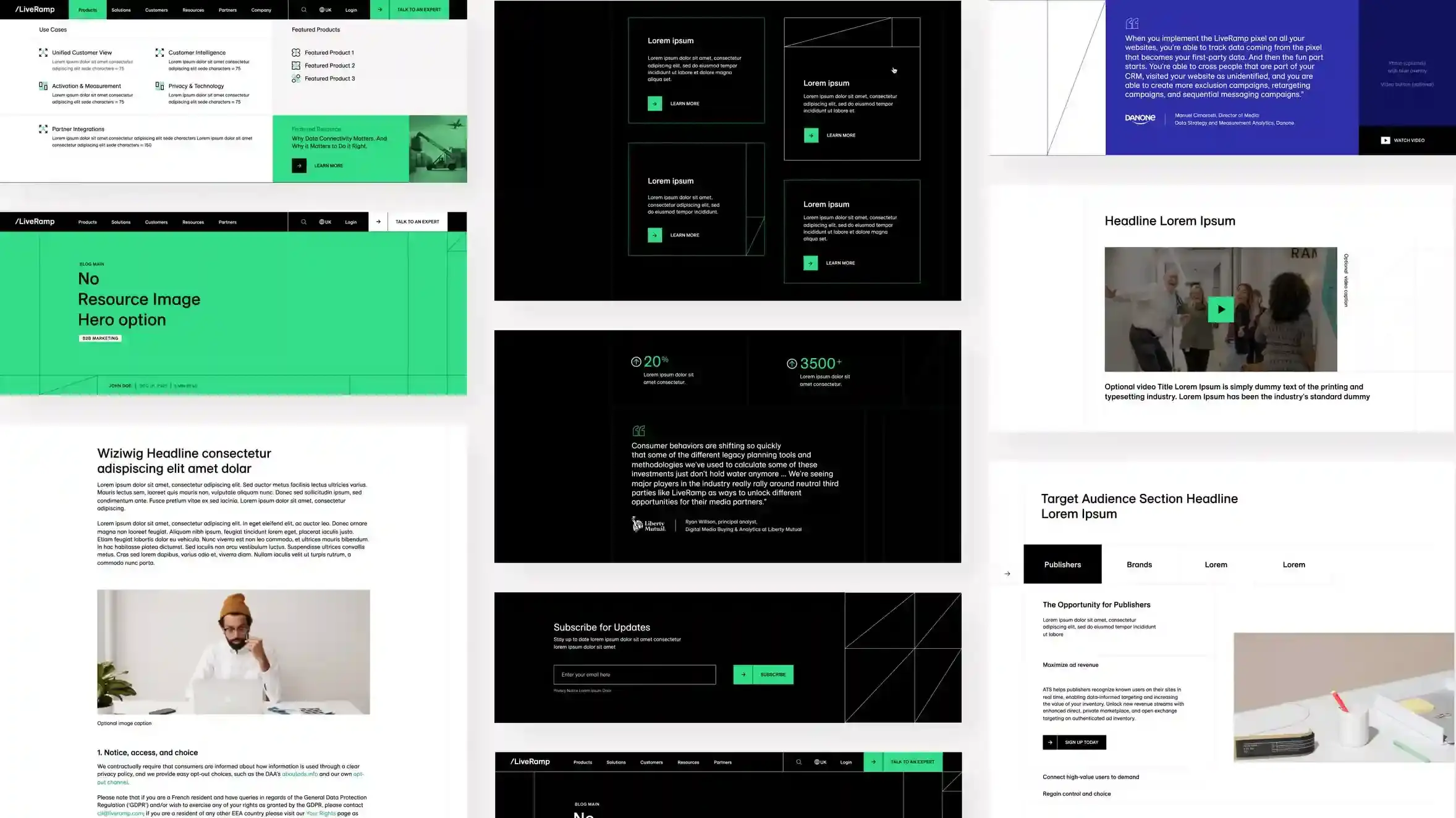
LiveRamp’s new website needed to embody their brand essence: ‘Radical Simplicity’. We designed the site around a grid system to symbolize flexibility and establish a feeling of interconnectivity, resulting in a single, continuous flow for visitors. Seamless and intuitive UI and UX, including pinning a section of the product on the homepage, contributes to a unified story throughout the site. A significant number of custom elements, including cohesive (but not repetitive) templates, were built and implemented for a tight launch timeline.
Impact
The new website launched just in time for LiveRamp’s summit, RampUp. They were very pleased with the coherent, clutter-free, and customer-centric final product. It was shortlisted for the 2022 Best B2B Website award on awwwards.com.
